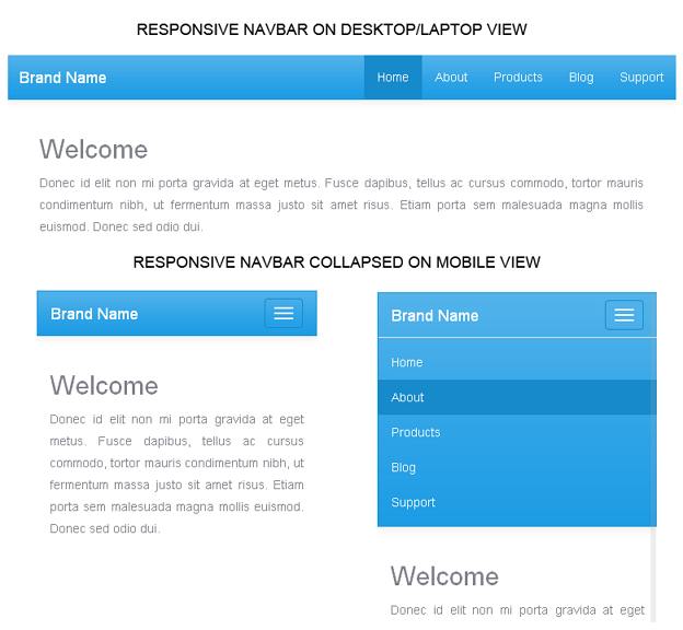
Just take a look at the below image, which depicts clearly of how our navigation bar at the top looks on different devices.

Plan Your Responsive Navigation Menu
First we’ll plan the design of our navigation bar. Once we’ve planned, it will be easier to put it into action. For the demo, I’ve planned to create a navbar at the top of the page, with the brand-name/logo at the left side and the menus at the right side of the bar.
Come! let’s walk through the steps one-by-one to make our goal.
Step 1: Make the Page Responsive
The first and foremost step to make our page responsive is to tell the page to span to the full width of the viewport available. So we'll add the below tag within the section of the html page.
<meta name="viewport" content="width=device-width, initial-scale=1.0">
Step 2: Create the Navigation Bar
Let's write the actual html markup for the navbar. Since I’m using HTML5, I’ll add <nav> element to create navigation bar. But it will work if you use the below given markup with <div> element.
HTML Markup<nav class="navbar navbar-default" role="navigation"> <div class="container-fluid"> <!--header section --> <div class="navbar-header"> <button type="button" class="navbar-toggle" data-toggle="collapse" data-target=".navbar-ex1-collapse"> <span class="sr-only">Toggle navigation</span> <span class="icon-bar"></span> <span class="icon-bar"></span> <span class="icon-bar"></span> </button> <a class="navbar-brand" href="#">Brand Name</a> </div> <!-- menu section --> <div class="collapse navbar-collapse navbar-ex1-collapse"> <ul class="nav navbar-nav navbar-right"> <li><a href="# ">Home</a></li> <li><a href="# ">About</a></li> <li><a href="#">Products</a></li> <li><a href="#">Blog</a></li> <li><a href="#">Support</a></li> </ul> </div> </div> </nav>
Our Navbar will now look like this.

We have used the css class “navbar-default” with <nav> element to create the above default navbar. The navbar is supposed to be made of two sections. One is the navigation header which contains the site logo or name and the other contains the menu itself.
In the menu section we’ve used "navbar-collapse" class to shrink the menus and make it stack one after another for mobile devices. Since we want the menu at the right side of the navbar, we’ve added the class "navbar-right". If you don't want the menu to be pulled up to the right side, you can neglect the class "navbar-right". Also note that it’s a must to includerole="navigation" to make your navbar accessible.
Step 3: Customize our Twitter Bootstrap Navbar
The default navbar is ok, but I want more spice to this. So I'm going to customize this plain design with some appealing colors and gradient. If our requirement is minimal, there is a quick and dirty method to customize the bootstrap classes. We can override the native bootstrap classes in a separate stylesheet and link them next to the bootstrap stylesheet in our html page.
So I'm going to create a stylesheet named "custom.css" and write some css styles to make the navbar look better.
Custom.css File Code.navbar {
background-image: linear-gradient(#54B4EB, #2FA4E7 60%, #1D9CE5);
background-repeat: no-repeat;
border-bottom: 1px solid #178ACC;
box-shadow: 0px 1px 10px rgba(0, 0, 0, 0.1);
border-radius: 0px;
}
.navbar-default {
background-color: #2FA4E7;
border-color: #1995DC;
}
.navbar-default .navbar-brand,
.navbar-default .navbar-brand:hover,
.navbar-default .navbar-brand:focus ,
.navbar-default .navbar-nav > li > a {
color: #FFF;
}
.navbar-default .navbar-nav > li > a:hover,
.navbar-default .navbar-nav > li > a:focus {
color: #FFF;
background-color: #178ACC;
}
.navbar-default .navbar-toggle:hover,
.navbar-default .navbar-toggle:focus {
background-color: #178ACC;
}
.navbar-default .navbar-toggle {
border-color: #178ACC;
}
.navbar-default .navbar-toggle .icon-bar {
background-color: #FFF;
}
After customizing, now this is how our final navigation bar looks. A few tweaks to the native bootstrap classes and here we have turned the plain navbar into an eye candy.

Create Fixed Navbar at the top
If you want this navbar to fixed to the top of the page, while you scroll down the page, all you have to do is to add one more class "navbar-fixed-top" to the <nav> element.
HTML Markup<nav class="navbar navbar-default navbar-fixed-top" role="navigation"> <!-- html markup goes here --> </nav>
Create Fixed Navbar at the bottom
Is it possible to fix the navbar to the bottom of the page? Yes, you can. Just add the class"navbar-fixed-bottom" to the <nav> element.
HTML Markup<nav class="navbar navbar-default navbar-fixed-bottom" role="navigation"> <!-- html markup goes here --> </nav>Source:
http://www.kodingmadesimple.com/2014/04/bootstrap-custom-responsive-navbar-tutorial.html

ngaruh di kecepatan website ndak kak kalau nambahin navigasi doang untuk memanggil Bootstrap
ReplyDelete